Building an Innovation Ecosystem Dashboard
Internship project designing and building a four-page interactive Power BI dashboard that turns regional innovation ecosystem data into a decision-making tool for non-technical stakeholders.
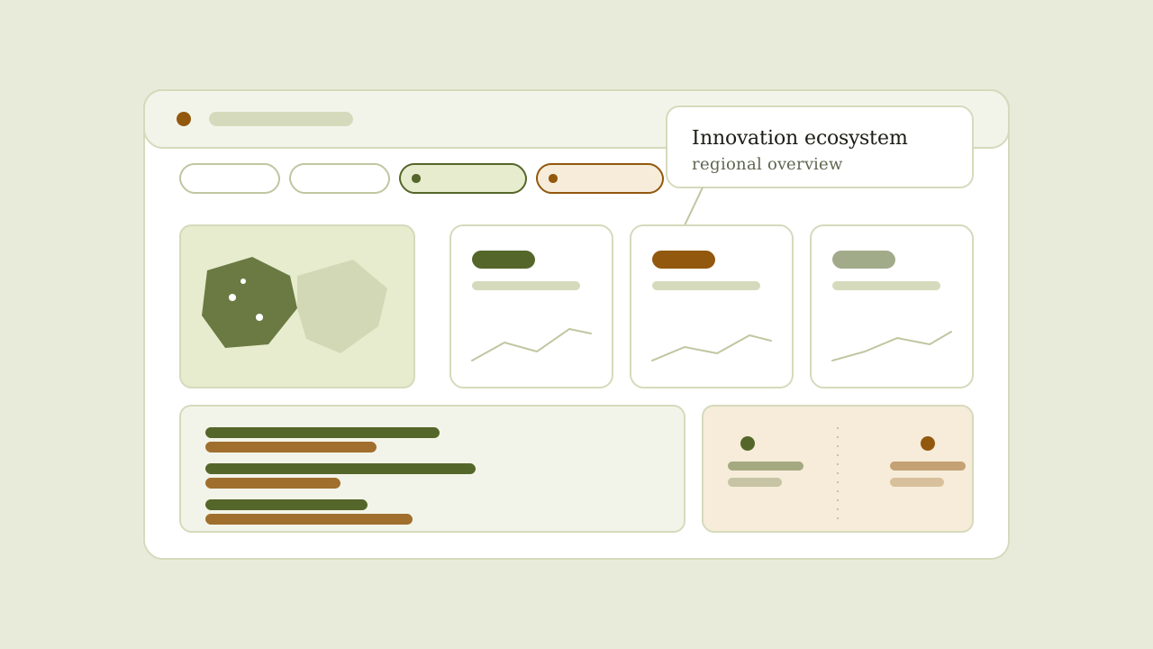
Context
De Innovatiespotter develops dashboards and regional analyses to help public-sector clients understand innovation ecosystems and the companies within them. During my internship, I collaborated with a data analyst to build a four-page interactive Power BI dashboard presenting this information to non-technical stakeholders.
Problem
Although the underlying data contained valuable insights, it could be difficult for clients to interpret. The challenge was to transform complex regional ecosystem data into a clear and intuitive tool that policymakers and other decision-makers could use without relying on spreadsheets or requesting new analyses for every question.
Approach
The data analyst managed the underlying data model, while I focused on how the dashboard communicated the information. I structured the dashboard across four pages, applied a consistent colour and layout system, and designed each visualisation to answer a specific business question. I also added interactive filters and a feature that allowed users to compare two regions directly.
Results & insights
The final dashboard enabled clients to filter data, explore regional patterns and compare innovation ecosystems across regions. By prioritising information hierarchy, visual consistency and clear storytelling, the dashboard made complex data easier to interpret and more useful in policy and strategic decision-making.
The project also showed me that effective dashboard design depends as much on deciding what not to display as on selecting the right visualisations. Designing for non-technical users required balancing detail with clarity and ensuring that every chart contributed directly to the user's decision-making needs.